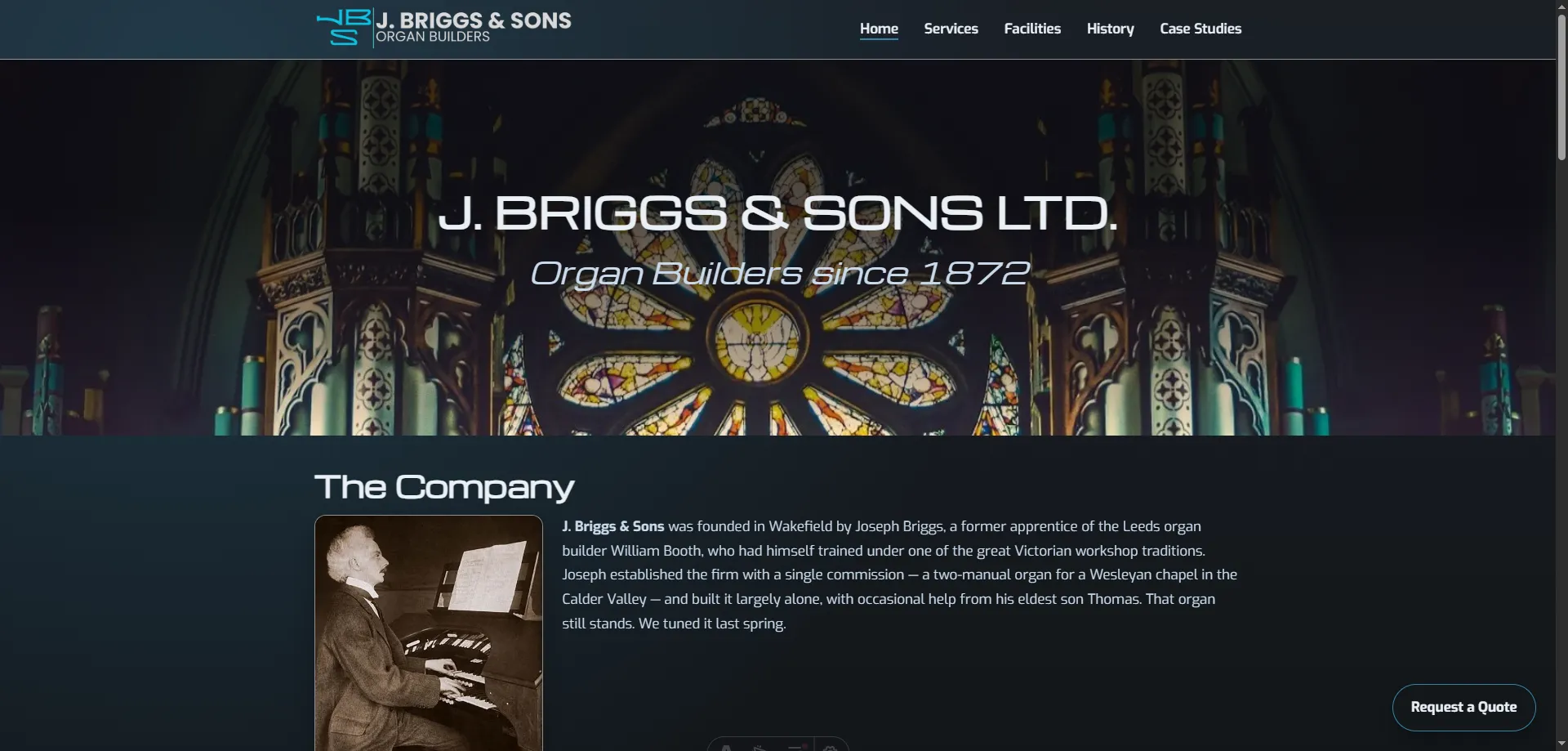
Every site we build follows the same underlying structure: a clear hero, deliberate page sections, and a layout system that keeps everything cohesive across the whole site. That gives us consistency where it matters, while leaving plenty of room to tailor the look and feel to each client.
What stays consistent
One layout system across pillar and content pages
We do not reinvent the page structure for every project.
Instead, we use a universal layout that gives every site a coherent rhythm across navigation, hero areas, section spacing, typography hierarchy, and content blocks.
That means pillar pages and content pages still feel like part of the same website, even when they serve different jobs.
Shared building blocks
Flexible components, consistent system
The same component library can be arranged differently depending on the page's purpose.
-
Hero sections
Clear opening context, strong hierarchy, and immediate orientation for the visitor.
-
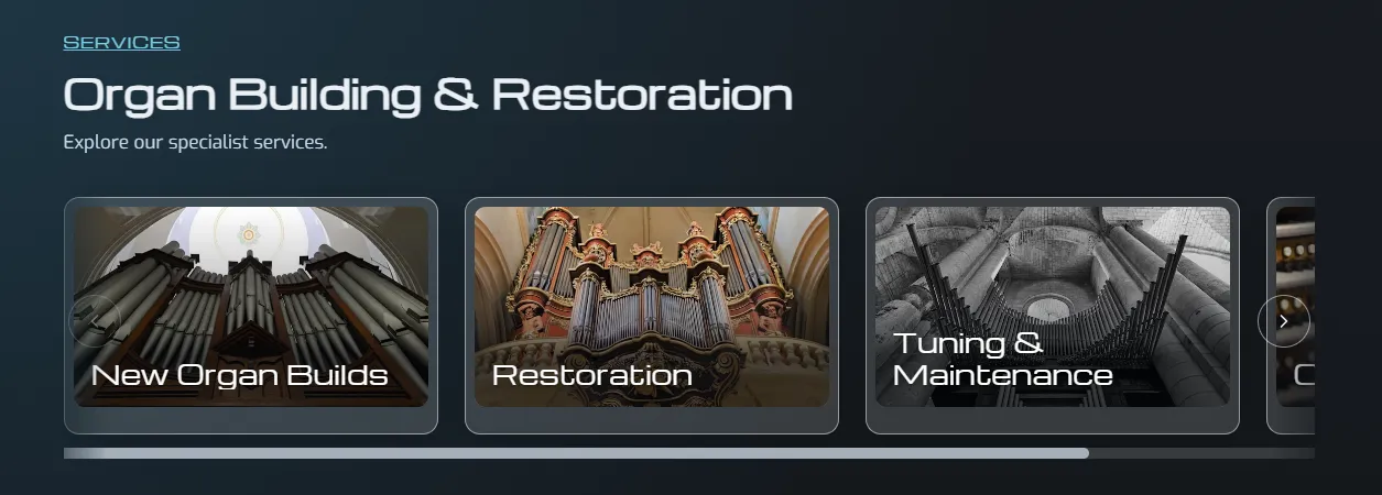
Card rails
Useful for scanning related topics quickly and sending visitors deeper into the site.
-
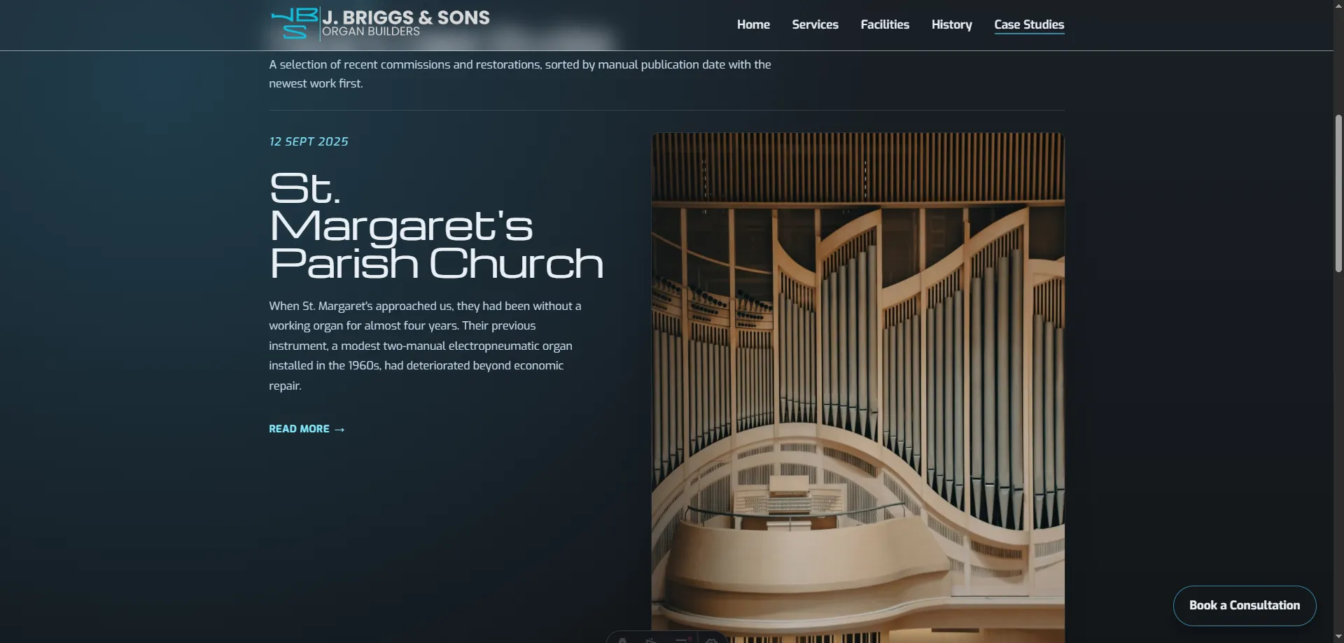
Content preview grids
Ideal for surfacing supporting articles, services, or case studies from a pillar page.
-
Editorial article sections
Long-form content still sits inside the same visual system, just with a calmer reading flow.
Built to direct traffic quickly
Pillar pages are there to catch broader intent and move people efficiently toward the right destination.
They work especially well for visitors landing from shorter-tail searches, where the first task is not to read everything, but to find the most relevant next step quickly.
Components like card rails and content preview grids make that easy. They create structure, surface relevant paths, and help visitors self-select without friction.
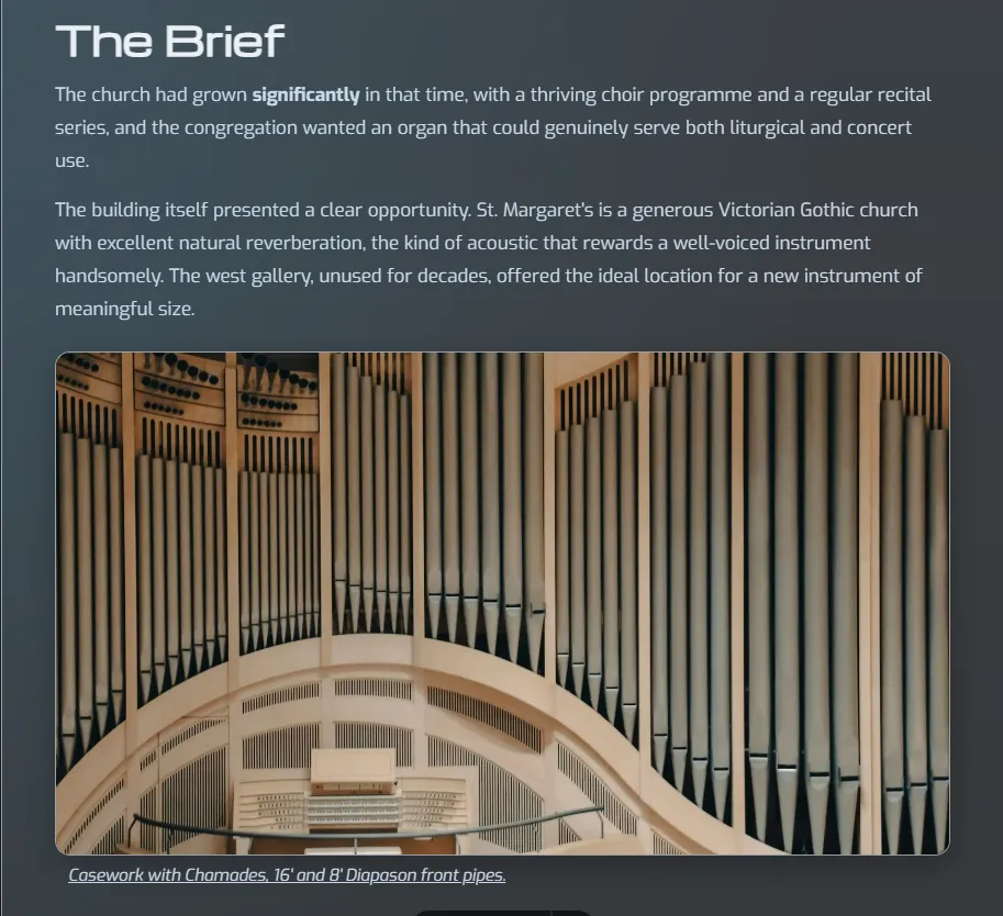
Editorial pages with a more magazine-style reading experience
Content pages use the same underlying layout logic, but the experience shifts from navigation to reading.
These pages are better suited to deeper explanations, clearer storytelling, and a more editorial presentation of information. The result feels closer to a magazine article than a landing page, while still belonging to the same site system.
Content pages slow the pace down and give the material room to breathe.
The structure stays consistent so the site feels coherent. The theme changes so it feels like yours.
Themes, colour, and typography can change completely
The layout system is universal, but the presentation is not fixed.
Colour palettes, light or dark themes, typography, image treatment, and overall tone can all be tailored to suit the client. That means we keep the technical and structural benefits of a proven framework without forcing every site into the same visual identity.
In practice
What this approach gives you
- A cohesive layout across every page on the site
- Faster decision-making because the structure is already proven
- Clearer navigation from broad landing pages into deeper content
- A more polished editorial experience on content-heavy pages
- Full freedom to tailor colour, typography, and tone to the client
Why it matters
Consistency underneath, flexibility where it shows
This is the balance we aim for in every build.
A reliable page structure keeps the site coherent, fast to build, and easy to expand. Tailored styling keeps it specific to the business instead of looking like a recycled template.
Same system underneath. Different personality on the surface.